The Ultimate Guide to Crafting Effective Call-to-Action (CTA) Buttons for Your Website
Have you ever visited a website and found yourself unsure of what to do next? That’s often due to a lack of clear and compelling call-to-action (CTA) buttons. CTA buttons are crucial for guiding your visitors toward desired actions, whether it’s making a purchase, signing up for a newsletter, or downloading an eBook. In this guide, we’ll delve into the art of creating effective CTA buttons that drive engagement and conversions.
Table of Contents
Understanding the Importance of CTA Buttons
Call-to-action buttons are more than just links on a page. They are a vital part of your website’s user experience and can significantly influence conversion rates. A well-designed CTA button provides clear direction to visitors, helping them navigate your site and complete desired actions. Think of CTA buttons as signposts that guide visitors toward making decisions that benefit both them and your business.
Key Elements of a Compelling CTA Button
Creating an effective CTA button involves several key elements:
- Clarity: The message should be straightforward and easy to understand.
- Visibility: The button should stand out on the page, making it easy to find.
- Relevance: The CTA should align with the user’s needs and the content on the page.
- Action-Oriented Text: Use verbs that encourage immediate action, like “Buy Now” or “Sign Up.”
By focusing on these elements, you can create CTA buttons that effectively capture attention and drive action.
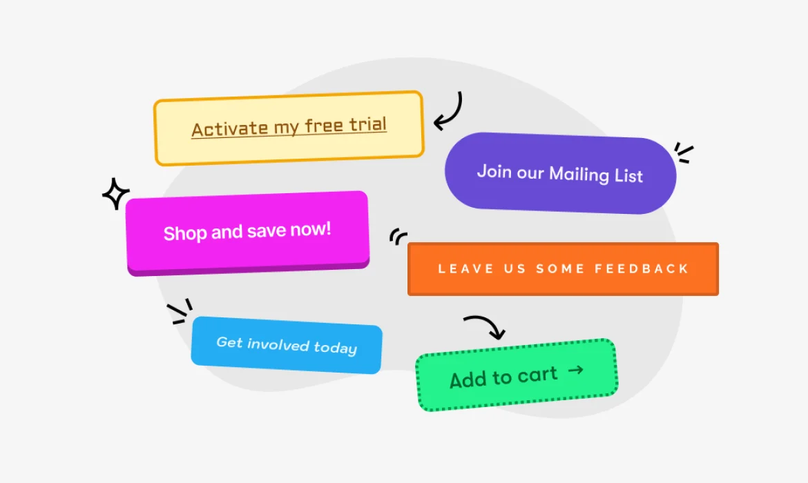
Choosing the Right Action Words
The language you use on your CTA buttons can make a big difference. Action words are verbs that prompt the user to do something. Here are some examples:
- Buy Now
- Sign Up
- Download
- Get Started
- Learn More
Using action words that are clear and compelling can significantly increase the likelihood of users clicking your CTA buttons.
Designing Visually Appealing Buttons
Visual design plays a crucial role in making CTA buttons effective. Here are some design tips:
- Size: Make sure the button is large enough to be easily clickable but not so large that it overwhelms the page.
- Color: Use contrasting colors to make the button stand out. Ensure the text color contrasts well with the button color for readability.
- Shape: Rounded corners often work well as they are more inviting than sharp edges.
- White Space: Surround your button with enough white space to make it stand out from other elements on the page.
A visually appealing button draws attention and encourages users to click.
Placing Your CTA Buttons Strategically
Placement is key to maximizing the effectiveness of your CTA buttons. Here are some strategies:
- Above the Fold: Place important CTAs where users can see them without scrolling.
- End of Content: After a blog post or product description, include a CTA to guide the next action.
- Throughout Long Content: In lengthy content, use multiple CTAs to capture attention at different points.
Strategic placement ensures your CTA buttons are seen and clicked.
A/B Testing Your CTA Buttons
A/B testing involves creating two versions of a CTA button to see which performs better. Here’s how to do it:
- Create Variations: Change one element at a time, such as color, text, or placement.
- Split Traffic: Divide your audience evenly between the two versions.
- Analyze Results: Use analytics tools to measure which version has a higher conversion rate.
Continuous A/B testing helps you optimize your CTA buttons for better performance.
Making Your CTA Buttons Mobile-Friendly
With more people browsing on mobile devices, it’s essential to ensure your CTA buttons are mobile-friendly. Consider these tips:
- Size and Spacing: Make buttons large enough to tap easily and space them adequately to avoid accidental clicks.
- Responsive Design: Ensure buttons adjust to different screen sizes without losing visibility or functionality.
- Placement: Place buttons in easily accessible areas, like the middle or bottom of the screen, where thumbs can reach them.
A mobile-friendly design ensures all users have a seamless experience.
Using Color Psychology to Influence Behavior
Colors can evoke emotions and influence behavior. Here’s how to use color psychology for your CTA buttons:
- Red: Creates a sense of urgency and excitement.
- Green: Associated with growth and positivity, often used for “Go” or “Start” actions.
- Blue: Conveys trust and reliability.
- Orange/Yellow: Grabs attention and suggests warmth and friendliness.
Choose colors that align with your brand and the action you want users to take.
Creating a Sense of Urgency
A sense of urgency can motivate users to act quickly. Here are some ways to create urgency:
- Time-Limited Offers: Use phrases like “Limited Time Only” or “Offer Ends Soon.”
- Scarcity: Highlight limited availability with phrases like “Only a Few Left” or “Limited Stock.”
- Countdowns: Implement countdown timers to emphasize the limited time available.
Urgency encourages immediate action and can boost conversions.
Ensuring Accessibility of CTA Buttons
Accessibility is crucial for ensuring all users can interact with your CTA buttons. Here are some tips:
- Keyboard Navigation: Ensure buttons can be accessed and clicked using a keyboard.
- Screen Readers: Use descriptive text for screen readers to convey the button’s purpose.
- Contrast: Ensure high contrast between button text and background for readability.
Making your CTA buttons accessible ensures all visitors can engage with your site.
Examples of Effective CTA Buttons
Looking at successful examples can provide inspiration for your own CTA buttons. Here are a few:
- Amazon: Uses “Add to Cart” and “Buy Now” for clarity and urgency.
- Netflix: “Join Free for a Month” highlights a no-risk trial.
- Dropbox: “Get Started for Free” encourages users to begin with no commitment.
These examples demonstrate effective use of action words, design, and placement.
Common Mistakes to Avoid
Avoiding common pitfalls can help you create more effective CTA buttons. Here are some mistakes to watch out for:
- Vague Text: Avoid generic phrases like “Click Here.” Be specific about the action.
- Poor Visibility: Ensure your button stands out and is easy to find.
- Too Many CTAs: Don’t overwhelm users with too many options. Focus on one primary action per page.
By steering clear of these mistakes, you can create CTA buttons that drive better results.
Conclusion
Crafting effective call-to-action buttons is essential for guiding your website visitors toward desired actions. By understanding the importance of CTAs, choosing the right action words, designing visually appealing buttons, and strategically placing them, you can enhance user engagement and boost conversions. Don’t forget to continuously test and optimize your CTA buttons to ensure they perform at their best.
FAQs
1. What is a CTA button?
A CTA (call-to-action) button is a clickable element on a website that encourages users to take a specific action, such as “Buy Now” or “Sign Up.”
2. Why are CTA buttons important?
CTA buttons guide users toward desired actions, improving user experience and increasing conversion rates.
3. How can I make my CTA button stand out?
Use contrasting colors, clear and action-oriented text, and surround the button with white space to make it stand out.
4. What is A/B testing for CTA buttons?
A/B testing involves creating two versions of a CTA button to see which performs better, helping you optimize for higher conversions.
5. How can I create a sense of urgency in my CTA buttons?
Use time-limited offers, highlight limited availability, and incorporate countdown timers to create a sense of urgency.